Your analytics & data tell a story.
Why do all analytics services look and feel the same? Is the usual "dashboard control center" the best structure to consume analytics data? Measureful wanted to revolutionize the typical experience by creating beautiful, automated marketing reports so you can focus on the things that matter.
ROLE: Art Direction, Lead Designer, UX
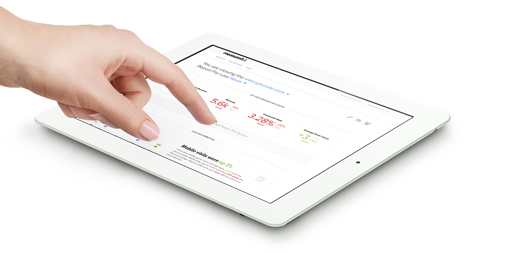
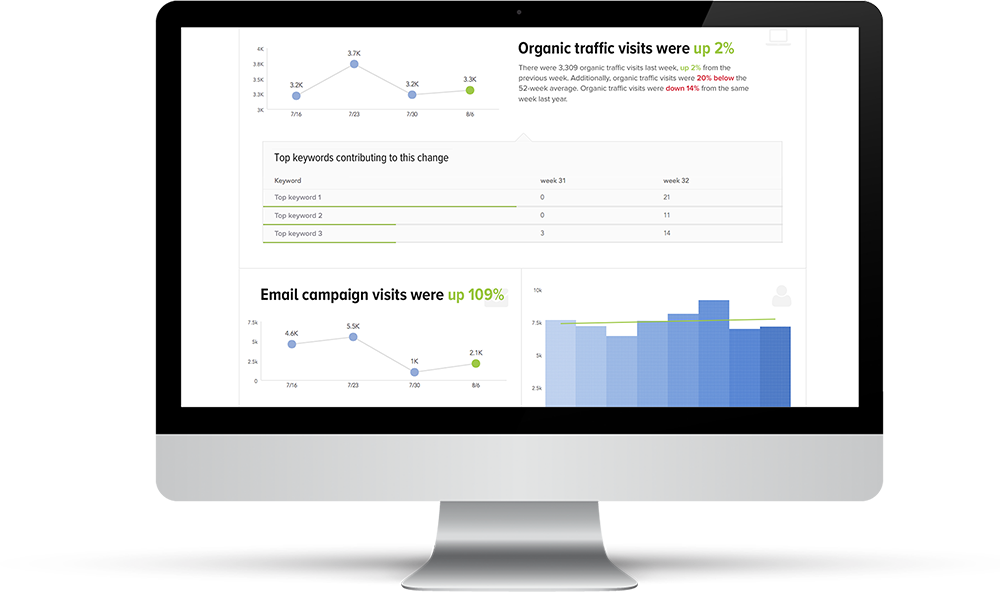
Telling stories with numbers.
The challenge of designing the Measureful experience was finding the middle point between the design of an infographic and the design of your typical analytics dashboard. Infographics, while pretty to look at the first time, lack the engagement that would make you want to come back and dig deeper. Analytics dashboards, on the other hand, are almost solely high-function but aren't exactly the most elegant designs.
By finding the middle point between these 2 ends, Measureful aimed to provide a tool that not only was highly functional but was also something pleasant to look at.
Early Measureful design ↓
Style
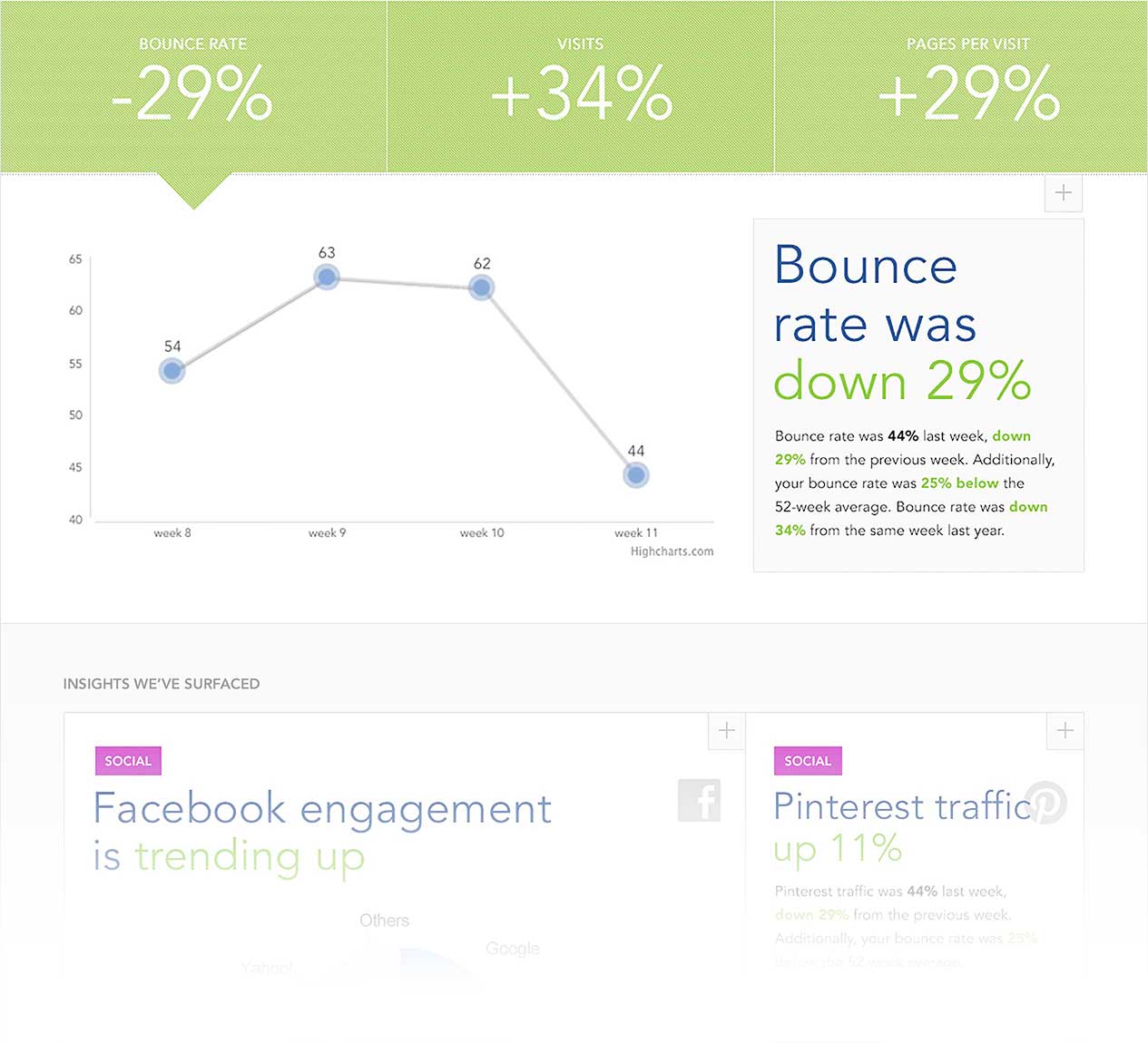
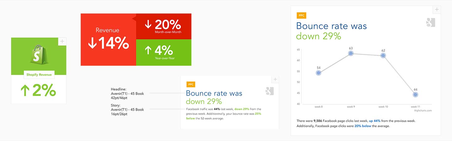
The style stayed very true to the initial Measureful brand. It was light and elegant. Readable but not without style. I developed the style guide and also framework for how data should be displayed and how it would look when at different sizes. I chose to fit each story (we called each surfaced Measureful insight a "story") within a 12-column grid that would change based on the importance of that particular story.
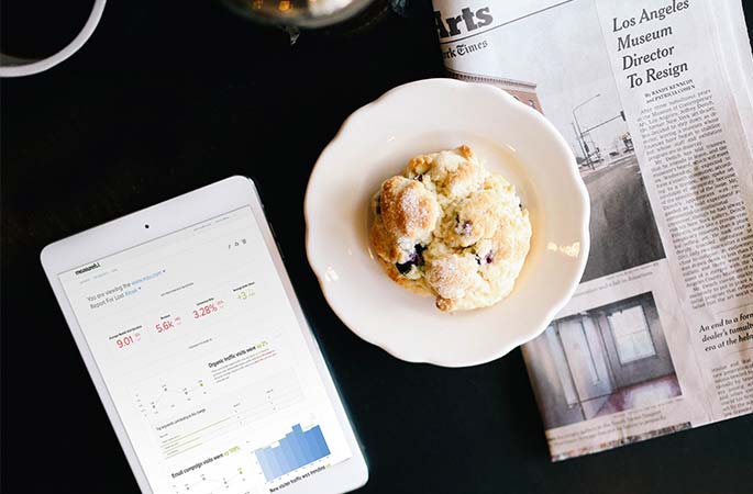

The Redesign
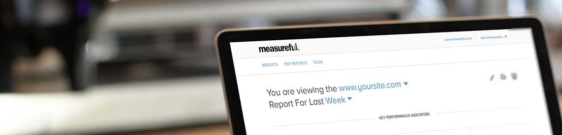
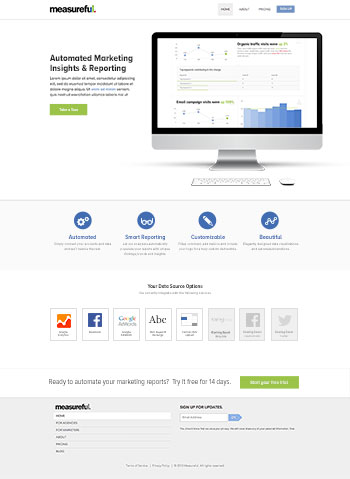
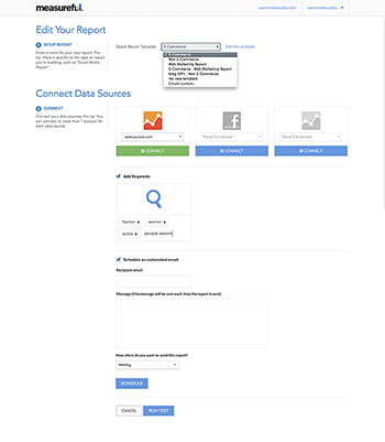
I was responsible for designing the experience from the ground up. That meant not only the main product design but also everything around that including the marketing homepage, layout builders, settings pages and every part of the site.
Homepage ↓
Edit Report Page ↓
And the Crowd Goes Wild
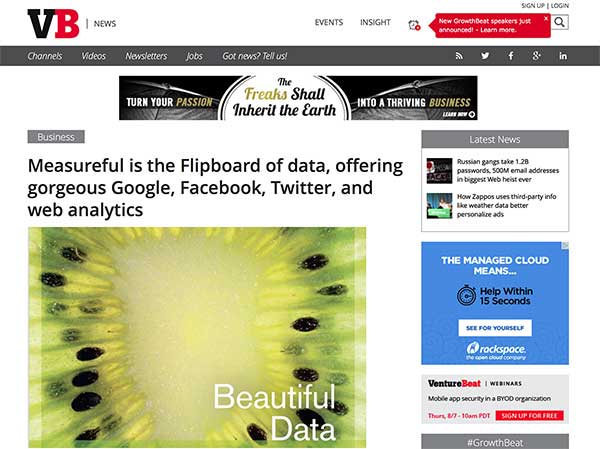
When Measureful relaunched their product with the updated design and new features, it was very well-received, including all the tech blogs you can think of. Measureful was acquired by Chirpify in June 2014.
Impressed? Or want to see more?
Measureful has been a hell of a journey. It was a rare opportunity to see a company go from just having a logo to one that had paying customers and also eventually got acquired.
Want to see more? Feel free to click around and see a few more case studies or get in touch with me to grab a beer or coffee.